Why a Designer Builds Tools
Designers feel tool pain before anyone else because designers live inside the gaps: the gradient that CSS cannot produce, the logo that arrives as a flattened PNG, the AI session that forgets every taste decision from the previous week. I know those gaps from my own work. Designers know design best, and the pain points are clearest when they interrupt the work in my own hands.
AI-assisted building changed that equation. Instead of waiting for engineers to turn design friction into tools, I can name the pain, design the workflow, build the product, and put it in other designers' hands. This case presents three tools I built from recurring friction in my own design practice, each shaped around what designers actually need to do better work.
Tool 01: Gradient Loom
A studio for premium gradients: mesh, aurora, and 3D color flows with layered material textures, exported as PNG or animated WebM.
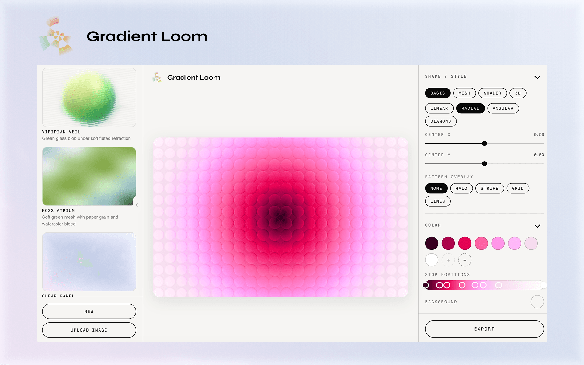
The studio. Drag mesh nodes directly on the canvas; every control speaks design vocabulary, not graphics jargon.
The Pain
There are hundreds of gradient generators already. In a directional scan of 12 browser tools, 9 (75%) focused on linear, radial, conic, or one mesh surface. They are useful for quick backgrounds. Premium gradients, like the mesh, aurora, glass, and 3D treatments showing up in current visual design, usually demand a different workflow. There are tools for those effects, but many are single-effect generators: one tool for mesh, one for aurora, one for glass, one for 3D. And because many of them are not designed from a designer's workflow, the controls can feel puzzling when the goal is simply to reach a specific visual quality.
The tools that can make almost anything tend to be Figma, Adobe, or Blender: powerful environments, but with enough features to make gradient generation feel disproportionate to the task. A gradient is a basic part of design. When it needs to feel considered, designers often spend more time fighting the tool than judging the result.
The gap is not a lack of possible effects. It is a lack of a clear way to control the parts that make a gradient feel premium.
The Tool
Gradient Loom starts from a formula:
SHAPE + COLOR + TEXTURE + MOTION = UPGRADED GRADIENT
I broke those parts apart, then studied the gradients designers repeatedly select in visual libraries to understand which combinations make a result feel soft, luminous, tactile, or dimensional. The important work was not to expose every possible matrix. It was to know the work, identify which controls are truly needed for the desired outcome, and arrange them into a clear flow.
The studio organizes that research into four primary modes: basic, mesh, shader, and 3D. Each mode is built around the decisions a designer actually makes, with direct manipulation instead of a graphics-programming workflow.
Texture is treated as a system, not a single intensity slider. Glass has four distinct modes: dots, fluted, clear, and liquid. Each mode gets the controls that actually shape its character: refraction, depth, frost, dispersion, surface breakup, and light. Grain, ink, metallic, paper, and pattern effects follow the same logic. Motion then gives the material a reason to exist over time, with PNG and animated WebM export for real use.
Under the surface it runs a custom WebGL renderer with hand-written GLSL shaders, backed by a CPU reference implementation and automated parity tests. The engineering is deliberately hidden behind design language: the designer adjusts smoothness, grain, depth, and light, never uniforms or blend equations.
The design call: know the work well enough to know what is really needed. Among thousands of possible parameters, Gradient Loom keeps the few that shape the outcome, names them in design language, and orders them into a flow that supports judgment instead of interrupting it.
Tool 02: Growing Brand
Brand memory that grows while you design: an open-source plugin that turns everyday design judgments into a living brand system.

Judgments are captured raw in a journal, then distilled upward into rules. Every promoted rule cites the entries that earned it.
The Pain
The current answer to brand consistency is usually a design.md, a token file, or a prompt that describes the designer's taste. Those documents are useful, but they are snapshots. They describe the part of taste that was explicit enough to write down, and taste itself changes as the work changes. The most important decisions still happen in passing: "warmer," "less rounded," "we're not a toy," "yes, that's it." Then the AI session ends and the evidence disappears with it.
The Tool
Growing Brand treats a brand as four layers:
- 1
Core
Identity-level rules that should survive across jobs: what we always do and what we refuse.
- 2
Tokens
Measurable decisions such as color, type, spacing, and shape.
- 3
Moves
Recurring compositional habits that make the brand recognizable in use.
- 4
Journal
Raw judgments in the designer's own words, including the context in which each decision happened.
The loop is:
The AI loads the current files before making design choices, silently records decisions as they happen, and promotes repeated evidence to the right layer. Core changes rarely and only after a rule proves itself across jobs; tokens and moves can evolve sooner. Contradictions are not flattened into a false rule; they split by context or stay visible in Tensions until more evidence arrives.
The design call: a brand is not a frozen style guide. It is a living record of taste, with a stable core and enough room to change. The system has zero ceremony: designers keep working, and the work stops forgetting why a choice was made.
Tool 03: Vectorable
Turns raster logos, icons, and flat artwork into clean, editable SVG, entirely in the browser.
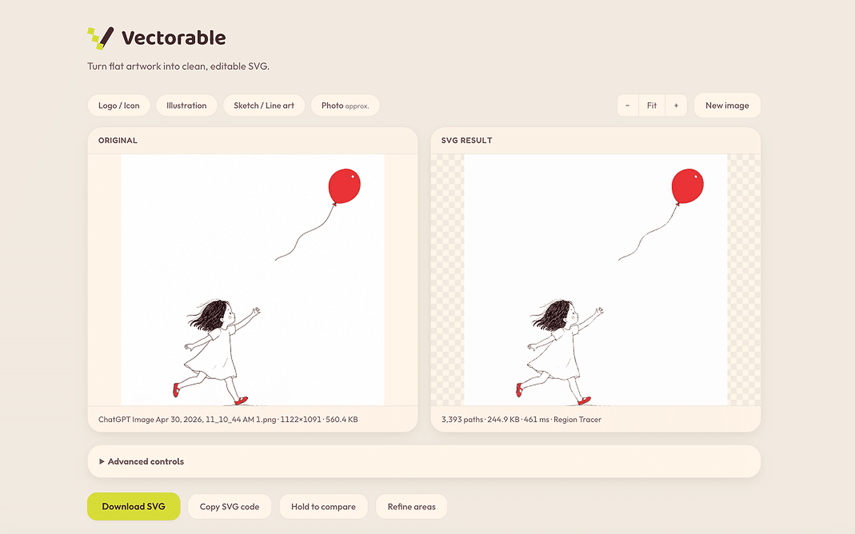
One drop zone, no accounts, no servers. The image bytes never leave the device.
The Pain
Turning a PNG into a vector is a small, frequent task that can still absorb an afternoon. The original logo or illustration is missing, the artwork needs to scale, and the obvious converters return a cloud of barely usable paths. Most lightweight converters rely on VTracer-style tracing because it is fast and easy to run in the browser, but for the flat logos, illustrations, and linework designers actually need, the result is often just below the quality bar. More advanced semantic vectorization research, including Im2Vec and newer work such as StarVector, points toward better structure, but those systems add cost, complexity, or a heavier workflow than this everyday task can justify.
The Tool
Vectorable takes a pragmatic middle path. It keeps the whole pipeline in the browser: decode, upscale, flatten the background, denoise, quantize or threshold, trace, and clean the SVG. A custom Region Tracer is the default for the cleaner flat-art results designers usually want, with VTracer (WASM) and ImageTracer.js available when a different image or tolerance calls for a different method. Re-traces run in a Web Worker, so the UI stays responsive and the image never leaves the device.
The quality lever is preprocessing, not simply choosing a fancier tracer. Median-cut color quantization controls how many shapes the output has; adaptive thresholding keeps variable-weight linework connected; SVGO then merges and cleans the paths. Presets make those tradeoffs legible for logos, illustrations, sketches, and photos instead of exposing a wall of technical controls.
The design call: better tooling is not always the most advanced tooling. It is the method that matches the job with the least friction and enough quality to keep the designer moving. Vectorable starts with the path that best fits common logo, icon, illustration, and linework tasks, then keeps two alternate tracers close by for the cases where the image needs a different tradeoff.
Reflection: The Method Behind the Three
Three tools, one method. Sit inside design work until a pain repeats. Name it precisely. Then build the smallest product that removes it.
Understanding the pain is the designer's half of the job, and it is the half that cannot be automated. AI collapsed the cost of the other half. A gradient studio needs a WebGL renderer, a tracer needs Rust and WebAssembly, a memory layer needs agent-workflow design, and I shipped all three without an engineering team.
This is what design engineering means to me. Not designers learning to code for its own sake, but designers no longer having to wait for someone else to fix the tools they work with every day.